The Value of Data Visualisation
We live in the age of big data. Our ability to collect, process, distribute, analyse and present complex information drives at pace our ever more sophisticated understanding of the world. Businesses are increasingly looking to visualisation techniques to drive dashboards and infographics that tell the story of their data in an accessible way. Managers now need to add data visualisation to their must-have set of skills. But what are the dos and don’ts? Let’s start with a 19th century shipwreck.

A half-submerged raft is cast adrift in violent winds on a dark and turbulent sea. Huge waves threaten to swamp the disintegrating vessel beneath brooding, thunderous clouds. Sat atop, barely clinging to life, are the fifteen survivors of the 147 crew and passengers who took to the raft after the French frigate Méduse ran aground off the coast of modern-day Mauritania in 1816. But that was clearly some days or even weeks ago. One survivor has been driven to madness and tears at his own hair. Another clutches the pallid-skinned body of his dead son, resignation writ large across his face as he stares despondently into the distance. About them lie the dead and dying. But amidst all of the despair of those driven to the very limit of human endurance, there is hope. A ship, barely visible on the far bright horizon, is spotted. Those strong enough to stand wave the tattered remains of clothes to draw its attention. Those too weak reach out imploringly or clasp their hands as if in prayer. There are no smiles of relief, no joyous laughter, as this is not yet a certain salvation.
Is Géricault’s The Raft of the Medusa ‘a picture that paints a thousand words’? Somehow it feels that no amount of descriptive narrative could ever capture what one feels and understands when first setting eyes on it. And yet, as demonstrated above, it can be described quite effectively in fewer than 200 words. In fact, it can be described with just six words, as if it were a banner headline – ‘people await rescue from makeshift raft’. But that description leaves a lot to the imagination of the reader.
In an organisational setting, it is perhaps prudent not to leave to chance what a reader might interpret from a picture. Best to stay firmly rooted in the realm of facts and figures to avoid the potential for ambiguity and confusion. That should have been on the minds of the creators of this. It’s an infographic that shows the companies owned by Disney. Two seconds staring at Géricault’s masterpiece and you get it at a basic human level. Two hours staring at this and all you see is Mickey Mouse.

Shoehorning the data (well, most of it at least) into the Mickey Mouse icon is crass, and gives the impression (incorrectly!) that the most important companies are in the biggest circle. And what of the companies that sit outside the three main circles? Are they less important?
As a means of conveying information, this graphic is utterly useless – a simple table would have been more illuminating (pun intended). All it really conveys is that Disney is big and complex. It reveals no trends or patterns. It offers no insights on the data. It does not aid understanding.
As the godfather of data visualisation, Edward Tufte, once said:
‘Clutter and confusion are failures of design, not attributes of information.’
We might infer, then, that visualisation is all well and good if we don’t need to know the specifics and seek only to convey an overall impression or to allow the viewer licence to interpret the meaning for themselves. If we need to convey ideas with absolute certainty, perhaps we should stick to numbers, facts and tables to avoid any potential confusion. For example, if four sets of data all had the same summary statistics, we might reasonably ‘trust the numbers’ and imagine that they all told the same story – a uniform and consistent picture:
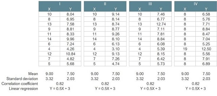
If the problem is still not obvious, let’s try visualising each of the four data sets:

So much for uniform and consistent! These values were devised in 1973 by the English statistician Francis Anscombe and are known as ‘Anscombe’s Quartet’. They illustrate the importance of plotting data before starting to analyse it. Each of the four data tables generates the same summary statistics, yet the four could not be more different. This only becomes apparent when the data are visualised. It seems that our brains struggle to comprehend tables full of numbers, but are fabulous at spotting patterns in two-dimensional space.
For data visualisation to be of value, it must ‘tell the story’ of the data and draw the eye to that which is meaningful. Here are some common pitfalls to watch out for.
Axes of Evil
This is one of the most common errors when using bar charts and isn’t always obvious at first glance. The chart on the left shows the gross domestic product per capita in 2019 for the UK and six other OECD countries. The chart implies a significant difference between the UK and the comparators, especially Portugal. But the difference has been exaggerated because the Y-axis does not start at zero. The chart creates the misleading illusion that the UK’s GDP per capita is seven times greater than Portugal’s. If we correct the Y-axis so that it starts from zero, a much truer picture emerges in the chart on the right:
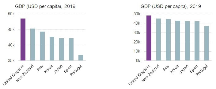
But there is still a lot wrong with this chart. By selectively filtering out the data from other OECD countries, the impression given is that the UK is the star performer. If there were a specific reason for comparing these seven countries, the chart would be perfectly valid. But if the intention were to comment on UK GDP per se, then the data are being presented significantly out of context to lure the reader to a false conclusion.
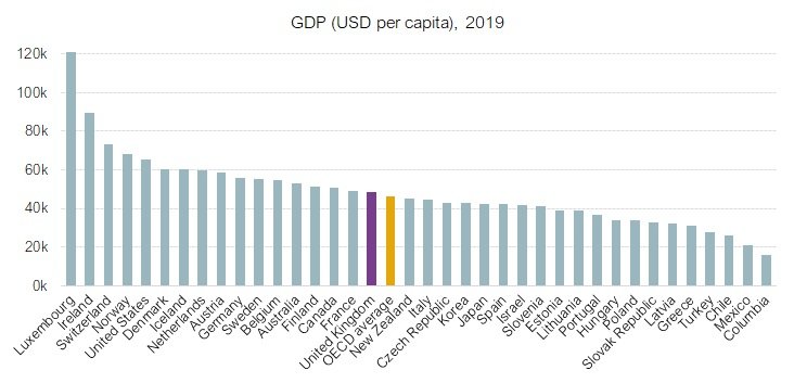
This can be corrected quite easily by filling in the data for all OECD countries. This reveals that the UK is more-or-less the same as the OECD average; not such a compelling story. It also reveals that we should all move to Luxembourg!
Bar charts should always extend to zero on the Y-axis because it is the area of the bar that represents the magnitude of the value. Dot plots and line charts, on the other hand, do not need to follow this rule, because they reflect how one variable (usually on the Y-axis) changes in line with another variable (usually on the X-axis).
The example below shows changes in ‘right first time %’ for a manufacturing process over a three-month period. There is one data point for each day. The first chart has the Y-axis extending to zero and gives the impression of a stable process. The second chart starts at 96.5% and reveals both the inconsistency of the process and the general decline in performance that the first chart completely masks:

Here is another problem to avoid. In the example below, a business process has become more efficient over time as technologies have improved and volumes have increased to create economy of scale. The relationship between FTE per unit and volume is almost perfectly linear, and is so strong that we might extend the projection and predict, with some confidence, that at around 10,000 units no staff will be needed at all. Getting suspicious yet?
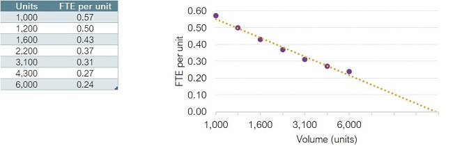
This chart’s problem lies with the X-axis. There are seven data points for volume, which are evenly spaced in the chart. But this is misleading because the gaps between the data points are not equal, as the table shows. The gap between the first two is 200 units, and between the last two is 1,700 units.
If the X-axis is redrawn to reflect the differences between data points, we discover that the trend is not linear at all – the rate of improvement in efficiency is not constant but is slowing down, so will never reach zero.
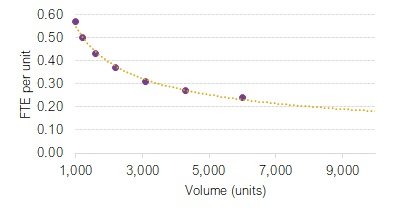
This error is particularly common when visualising data in a time series. It is always worth sense-checking a visualisation if trend-lines extend to (or below) zero, or above 100%.
Omitting the axis scale altogether in this next visualisation is effective in reducing clutter; the axis is foregone in favour of displaying the values in the bars themselves. This simplification helps to draw the reader’s eye to the magnitude of the differences. The problem here is that the differences have been exaggerated in order deliberately to mislead (the chart on the left). Without regularly spaced labels on the Y-axis, we have no visual cues to tell us that the red and yellow bars have been treated with a little artistic licence. The chart is intended to demonstrate that the UK Liberal Democrat and Labour parties are hot on the heels of the Conservative party. But take a closer look. The gap between the red and yellow columns is greater than the gap between the yellow and blue columns, despite the former representing a difference of 4 percentage points and the latter a difference of 10! This is pure sophistry and subterfuge. If the blue column is taken as the point of reference for scale, then the red column is actually showing a value of 28% and the yellow column a value of 34%. The chart on the right shows how it should look if drawn correctly to scale:

Proportional ink
The concept of proportional ink simply means that the size of a shaded area in a visualisation should be proportional to the numerical value that it represents. The dodgy GDP bar chart shown earlier illustrates this – the bar for the UK has seven times as much ‘ink’ as the bar for Portugal even though the value for the UK is only 32% larger than that for Portugal.
But this problem is not limited to bar charts. Here are two examples that definitely put form before function and misrepresent the data through disproportionate ink.
The first is the sunburst chart. These actually contain a lot of information in a compact form. Here it is showing the hierarchical structure of a staff of 204 people. Each ring of the chart represents a layer of the organisation. The CEO is at the centre; in the next layer are the CEO’s direct reports; in the next layer, their direct reports, and so on:
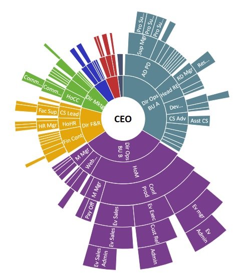
Showing the structure of an organisation in this way is much more compact than the traditional organogram and purports to show the relative sizes of the departments. But there is a problem. A wedge representing one person in the lower layers of the organisation (the outer rings) is much wider than a similar wedge in the higher layers (the inner rings). So, values in the outer rings carry more ink than the same values in the inner rings. This chart emphatically gives the impression that Business Unit B (purple) is the largest department. But it is an illusion created by the fact that Business Unit B extends to layer 7, whereas Business Unit A (blue) only extends to layer 5. Business Unit A is actually the largest, as this visualisation shows:

The second offender is the multi-layered doughnut chart, as shown here:

Charts like this are trendy; no self-respecting dashboard would be seen dead without one. But look closely at what is going on here. The value for Team E is double that for Team A, so it should use double the amount of ink. But because of the radial nature of the doughnut chart, the bar for Team E has to ‘cover more ground’ being on the outside than it would if it were on the inside of the circle. Instead of having double the ink of Team A, Team E has six times the ink. It is impossible to see the true meaning of the data in this representation.
The use of colour
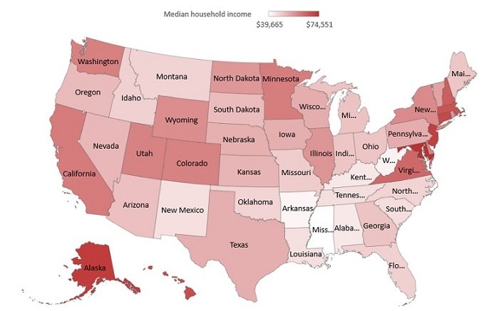
The sunburst chart above makes use of colour to indicate groupings by department. The earlier chart for GDP among OECD countries uses colour to help the reader pinpoint the bars for the UK and the OECD average. Using colour in this way to indicate groupings or to highlight specific values helps the reader to orientate themselves within a visualisation. But our brains are far less adept at using colour to differentiate values. Take this heatmap, for example:

The problem here is that it is visualising the magnitude of specific values. But we cannot determine what they are. All we perceive is a general impression that dark reds are different to dark blues. We infer that Arkansas and Alaska are different, but which is high and which low? And how do we interpret white (Illinois, for instance)? Does it represent a lack of data? Or perhaps it represents the value zero? Actually, in this visualisation it is used as a ‘crossover colour’ between blue (low values) and red (high values). Revisualising using a single colour is an improvement. We naturally interpret light hues as low values and dark hues as high. At least now we can infer that Arkansas is low, Alaska is high and Illinois is somewhere in between. The legend at the top is a useful aid, but adding the values would be even more helpful.
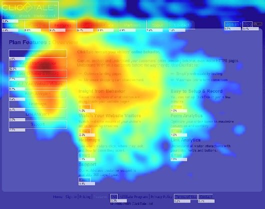
This is not to say that heat maps make poor visualisations. Our natural inclination to interpret red as ‘danger’ and green as ‘safe’ means that colour adds a strong visual cue in risk matrices. And because we naturally think of blue as representing ‘cold’ and red as ‘hot’, there is no ambiguity in the heat map below. This shows cursor movements on a web page. The links at top left clearly draw more attention than the text on the right of the page. We do not need the specific values to know that if we want viewers to click through to the links on the right then we might need to redesign the page. The heatmap has done its job.
Just because you could, it doesn’t mean that you should
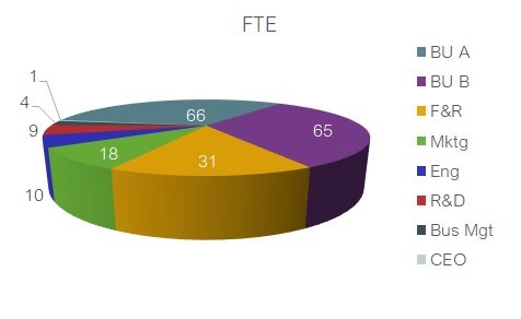
When Microsoft introduced 3D charts to Excel, we all went a bit loopy. Re-rendering the organisation data from above onto a 3D pie chart allows us to take disproportionality to Olympic levels. Now, we can make the Finance and Resources (F&R) department look the largest, despite it having less than half the staff of Business Unit A:
And what about the monstrosity below? This almost defies explanation. The enhanced perspective makes everything in the foreground look bigger than it really is. The axis labels are crashing into each other. Drum and percussion sales are almost entirely obscured by the columns for keyboard sales. We cannot accurately detect the year in which keyboard sales caught up with bass sales. We cannot tell that live sound sales were the same in 2019 as they were in 2010. We could go on, but you get the idea – this is a train crash of a visualisation.

Just because there are three categories of data (product line, year and revenue) it does not mean that three axes are required. What’s wrong with a simple line chart? Look how clear everything is in this revisualisation of the same data. And never underestimate the power of using grey to highlight specific data points:

Finally in this section, here are a couple of cool looking gauge charts from a corporate dashboard. That’s a lot of eye candy to display two values! Less would definitely have been more in this case:

Above all, make sense
Even if you manage to follow everything suggested above, and produce a visualisation that ‘follows the rules’, it is always worth standing back and checking that it makes sense. Here’s a chart showing how well five teams are focussed on value-adding activity.
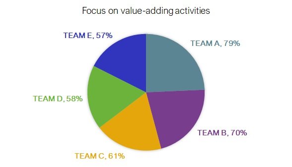
This pie chart shows the values of the teams with proportionate ink. Tick! But pie charts are used to show each item as a percentage of the whole. That is, the percentages should add up to 100%. Here the total is 325%! The data are drawn in proportion, but this is the wrong type of chart because each value is discrete and independent of the other values, not sub-divisions of a single whole. Just because you have percentages, don’t automatically think that the answer is a pie chart.
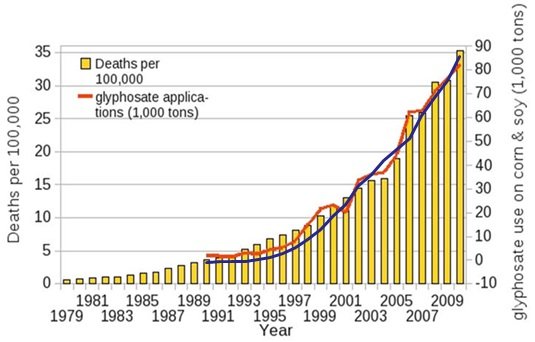
Beware also of drawing false inferences about causality from your visualisations. A debate has been raging for some years about the health risks associated with the use of the weedkiller glyphosate. It has been linked to increasing rates of cancer, autism, intestinal infection and, as shown below, senile dementia. Looks pretty convincing, doesn’t it? The red line for glyphosate usage almost exactly matches the increase in the yellow columns for dementia deaths:
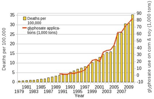
If you have been paying attention, though, you might have spotted the main reason why. The Y-axis on the right (for glyphosate) starts at -10,000 tons! The scale has been manipulated to enhance the visual similarity. But this isn’t the worst problem on show here. The chart is showing us that glyphosate usage exactly matches the rise in dementia deaths to encourage us to draw the conclusion that the former is causing the latter. We could draw the same chart for various cancers, autism and intestinal infections and they would all show the same thing.
Now, glyphosate may, or may not, be linked to these illnesses. We offer no opinion either way. But we can say with some authority that this chart does not demonstrate the link, even though it appears that it does. And we can prove that point with one simple addition to the chart:
We have superimposed the proportion of the world’s population that uses the internet (the blue line). So, this clearly shows that internet usage also causes dementia, right? Or even, if we are to take this to argumentum ad absurdum, that glyphosate causes internet usage? You see the problem? The correlations are hard to deny, yet these suggestions are clearly knuckle-headed lunacy!
If the visualisation of one data set against another creates the impression of direct association, it is fine to ask, ‘is there a causal link here?’ But the mistake made by many is automatically to assume causation without examining the relationship further.
In conclusion
Real world data are not as extreme as Anscombe’s Quartet. But hopefully the lessons are clear:
Beware summary statistics that are taken out of context
Data analysis without visualisation risks missing the obvious; visualisation without data analysis risks missing the important detail
Always check your axes and keep things in proportion
Use colour wisely and avoid gimmicks that put form before function
Be careful what you infer from a visualisation.
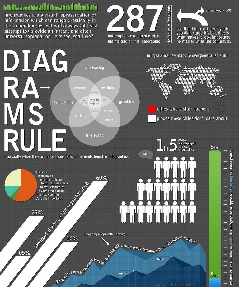
The final word goes to Think Brilliant and their satirical yet cautionary infographic. This should make you laugh and wince in equal measure! Make sure that your data visualisations are designed to enhance understanding, not to obscure it: